Duration: 1 month
Team: me and one fellow coworker
My contribution: Equal parts whole project
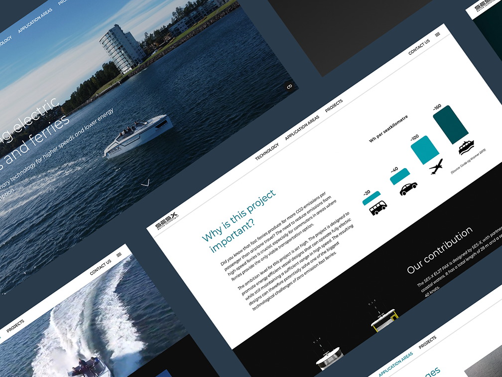
We were assigned to create a UX and UI for a control panel screen on SES-X Marine Technologies private vessels. We were given free reigns to explore and did a thorough research phase and in-house interviews to create a first edition screen. During all phases we continuously collaborated with developers, marine technicians and business developers in the company.
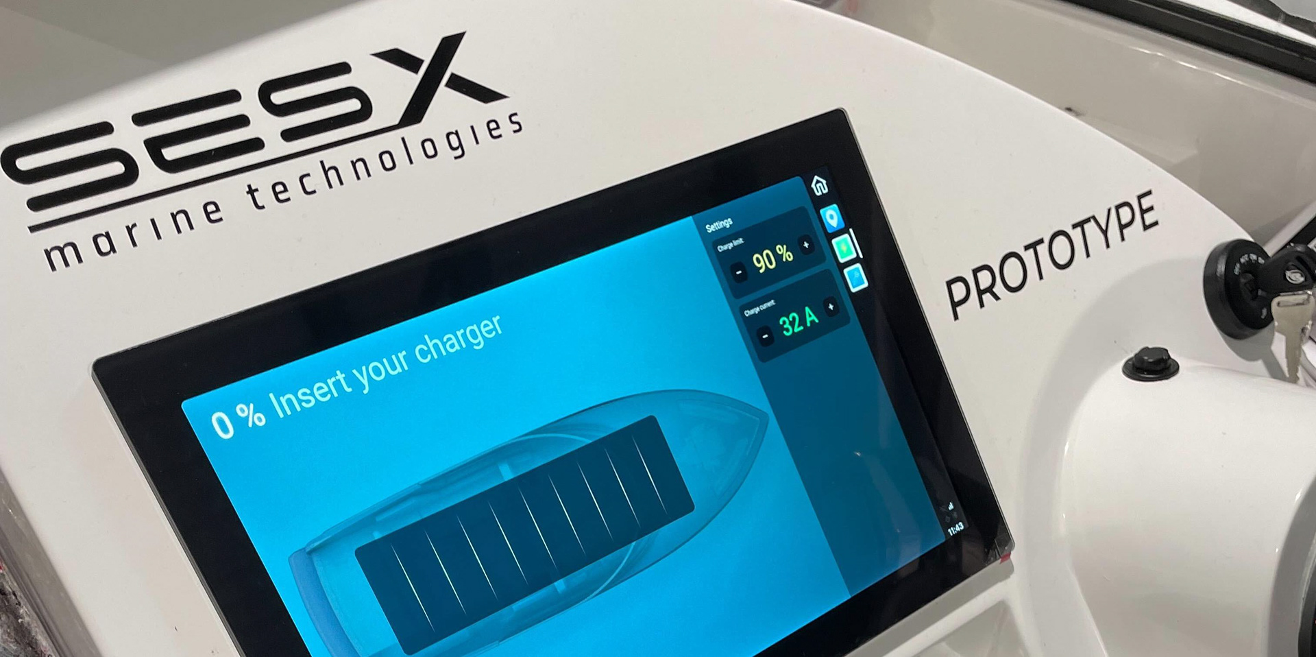
Before our project the screen on the leisure prototype looked like this
The insight phase included market research on different existing solutions, interviews, personas and user stories. We then sorted possible functions in MoSCoW and "effort vs impact" boards. This way we found irritations in current market equipment and what functions to include in ours. For example, we found out that it is difficult to navigate around the map on a wet touch screen, which guided the project to end up with three physical elements: joystick, back-button and ON/OFF button.
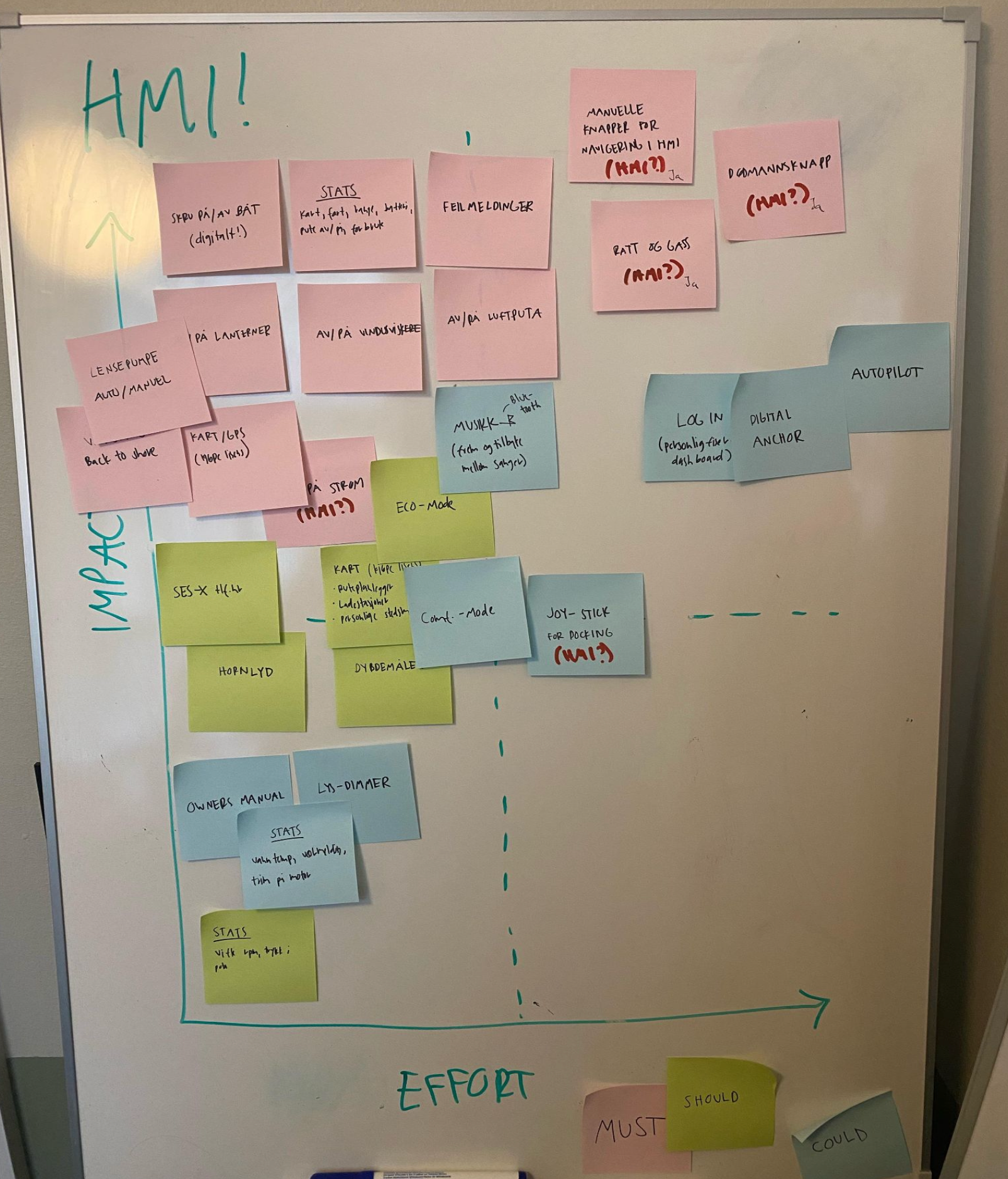
MoSCoW on Effort vs Impact
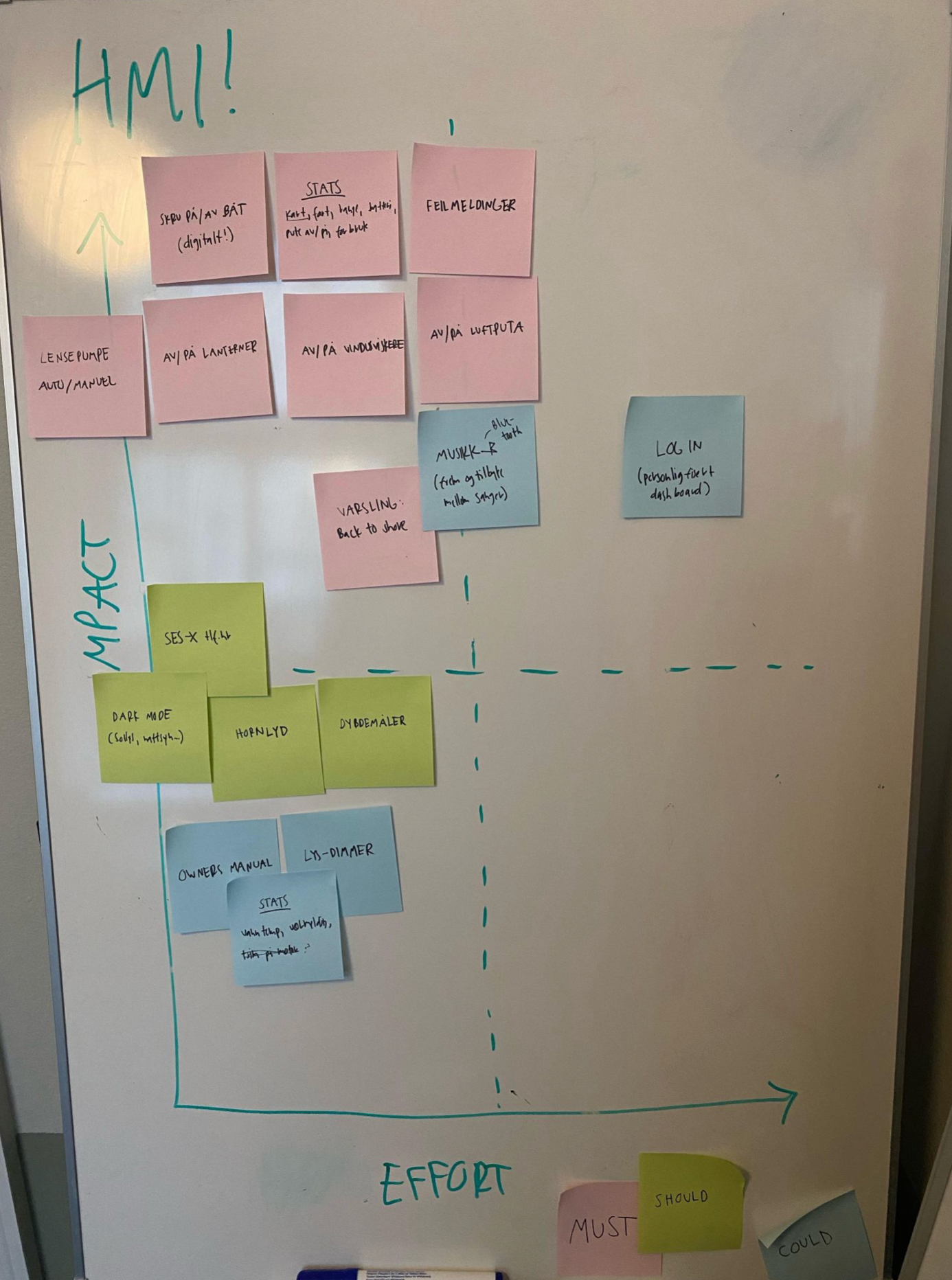
After priorization
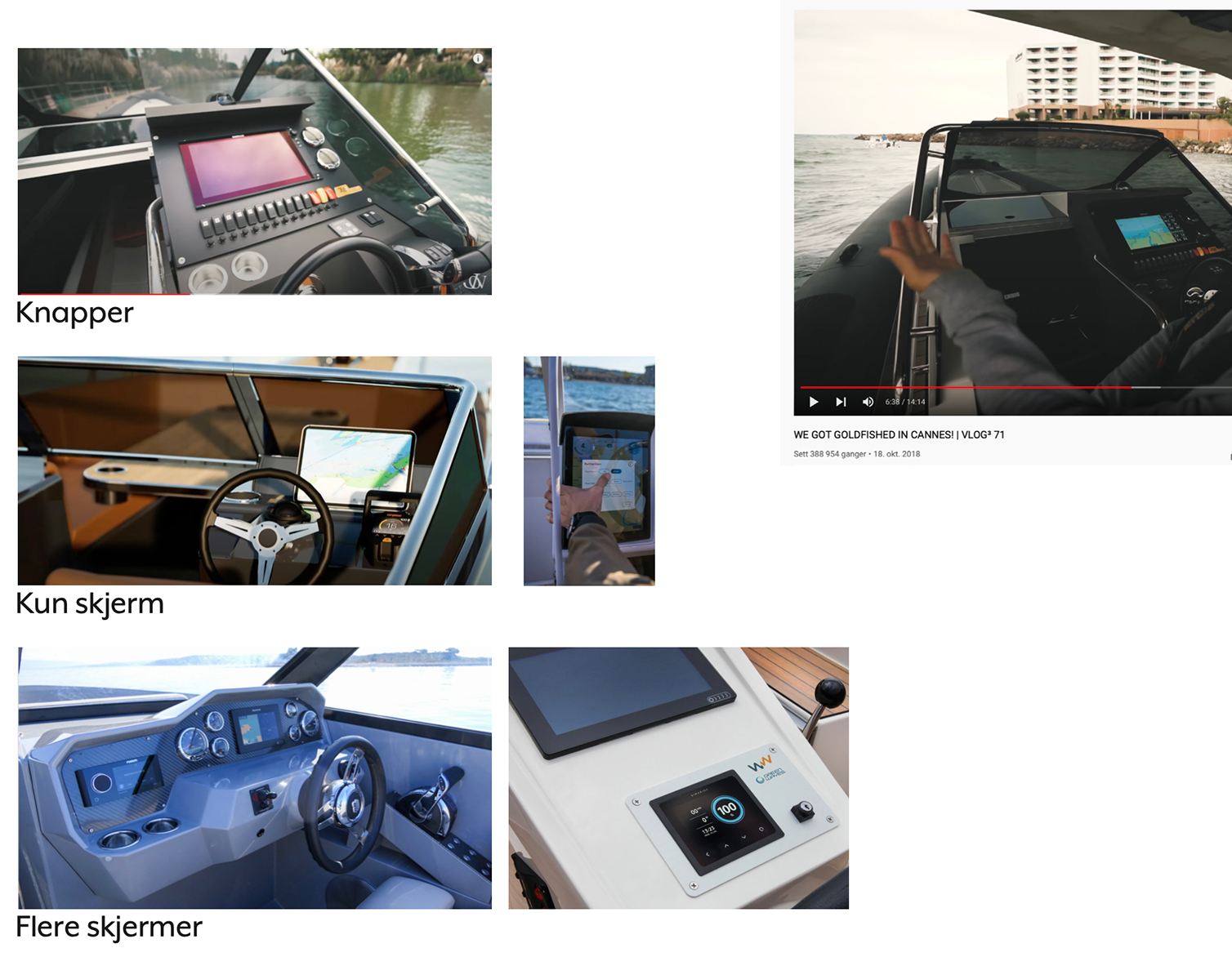
Categorisation on buttons vs only screen
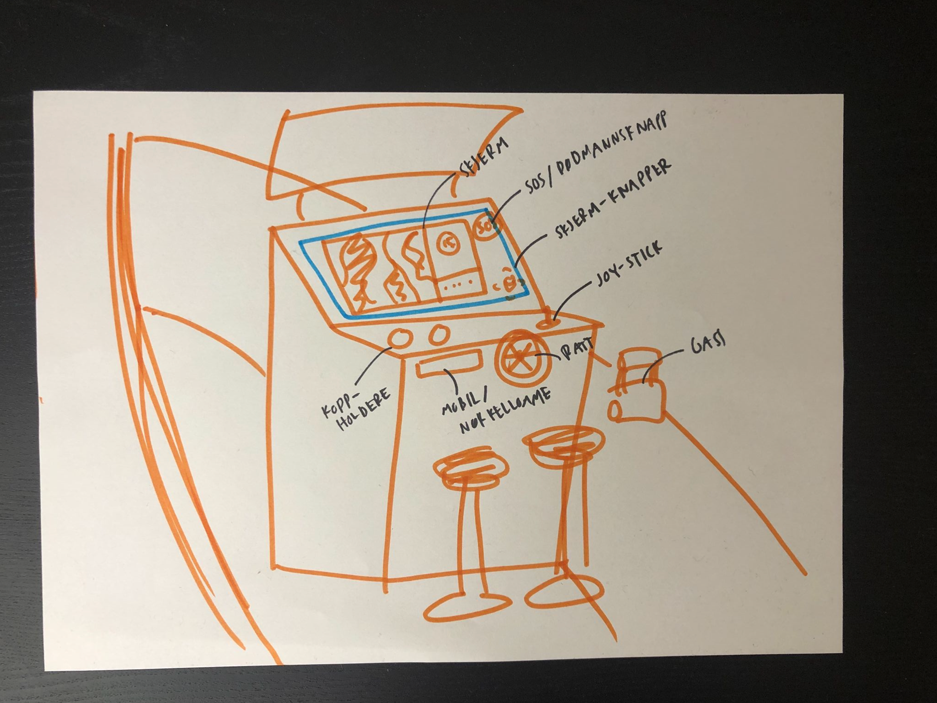
Initial concept with physical buttons/joystick and touch screen combo
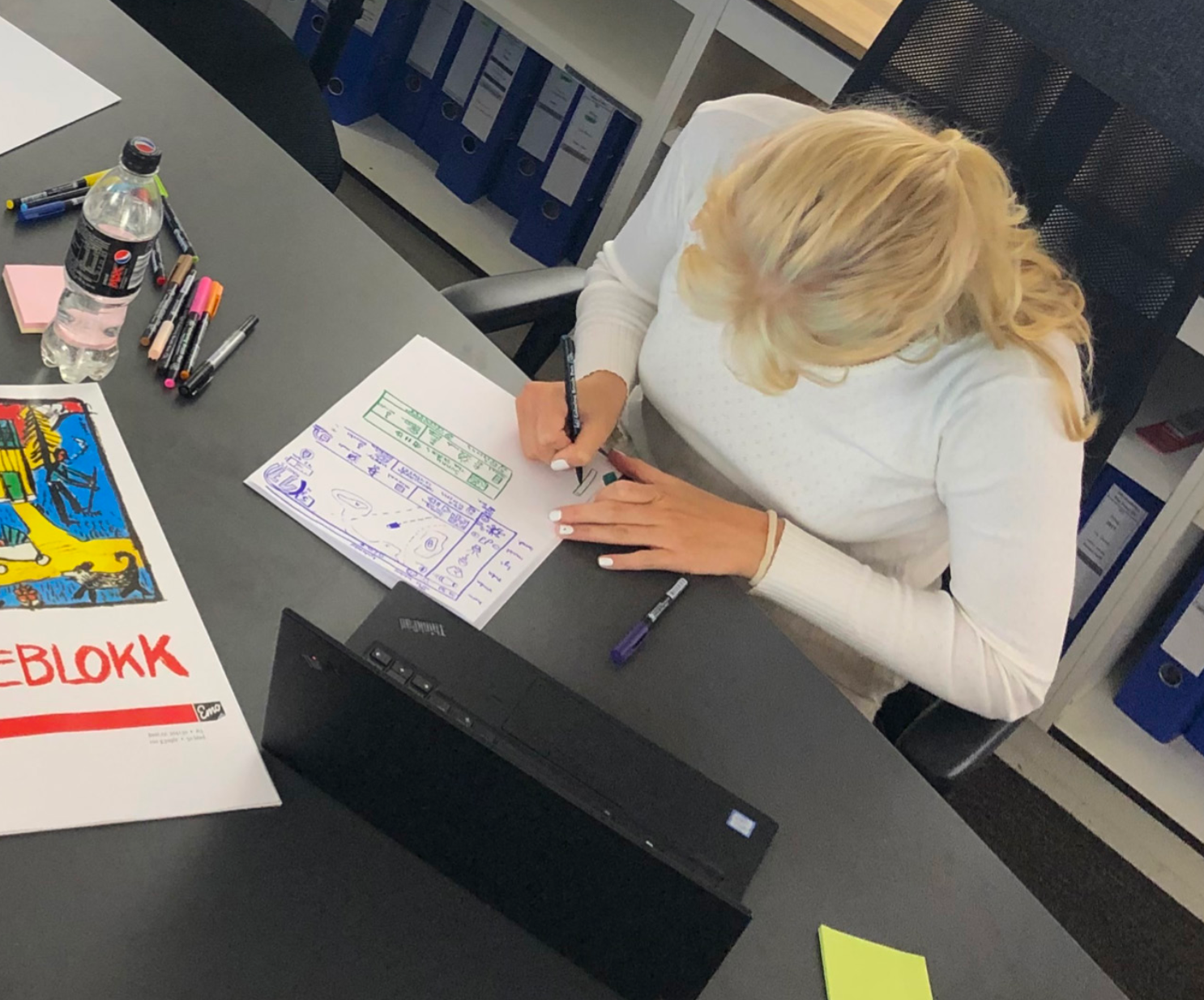
During the prototyping phase we created low-fi wireframes, where we invited people to press the drawn buttons on the paper, and placed new frames on top of the old ones until we found a missing function or a misleading path.
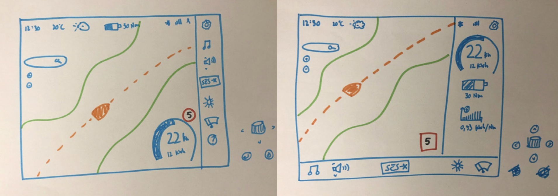
We also got feedback on the most logical setup of the menu bar, either vertical or horizontal placement.
After we had gathered enough feedback from the drawn prototypes, we made a simple, clickable figma prototype to handle functionality and size of elements, with the first symbol we could find for the different page elements. This sped up the process by not lingering on aesthetics, but purely focusing on the functionality.
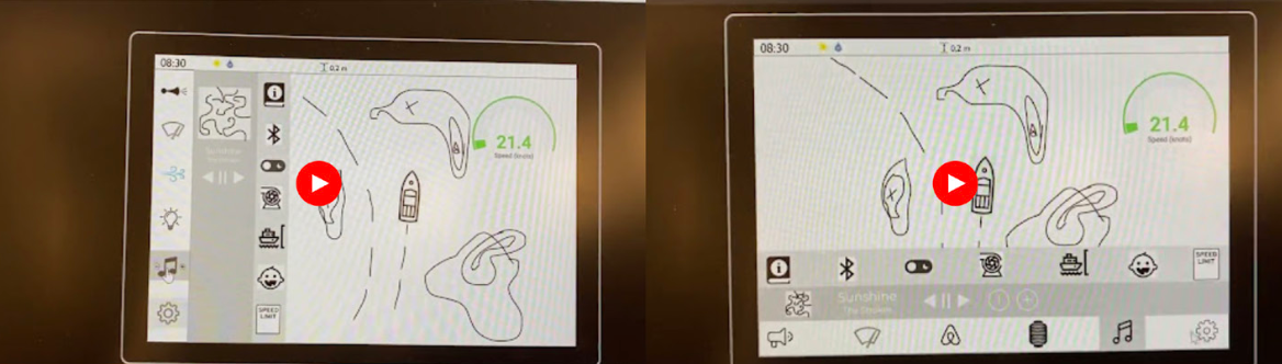
Here we tested bottom menu vs left side menu
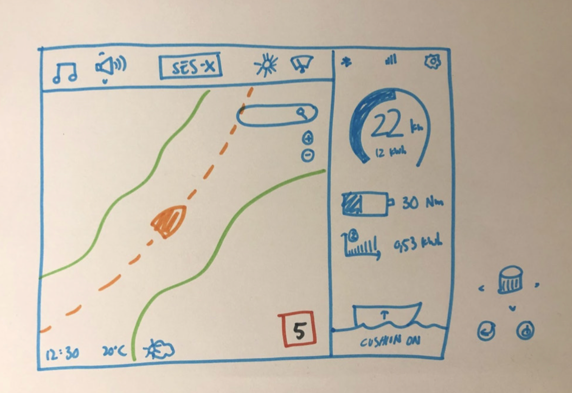
Before we cleaned up the digital prototype, we went back to the drawing board with all our feedback, to create a drawn sketch of the final version to guide us in making the final mockup.
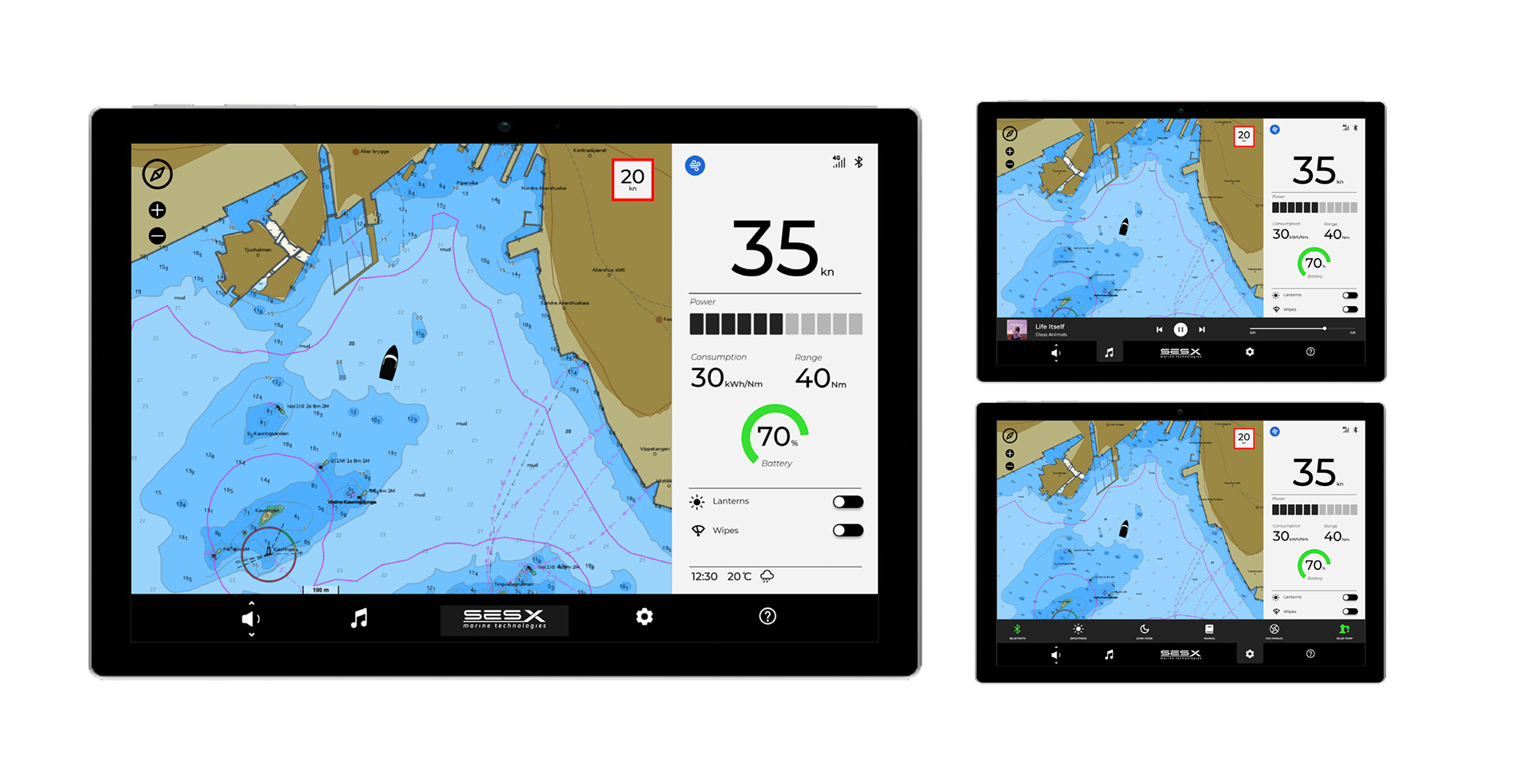
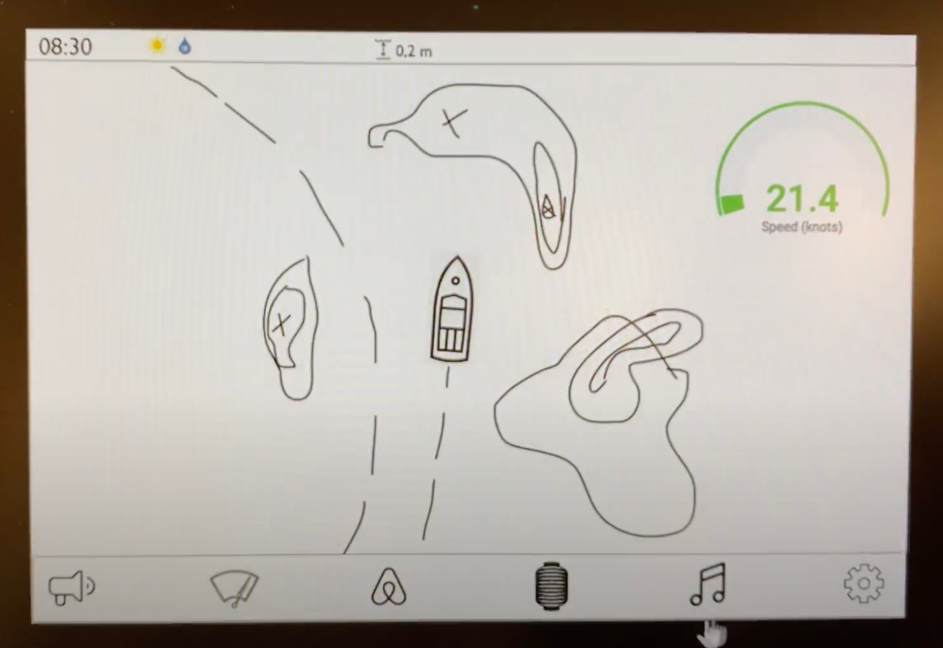
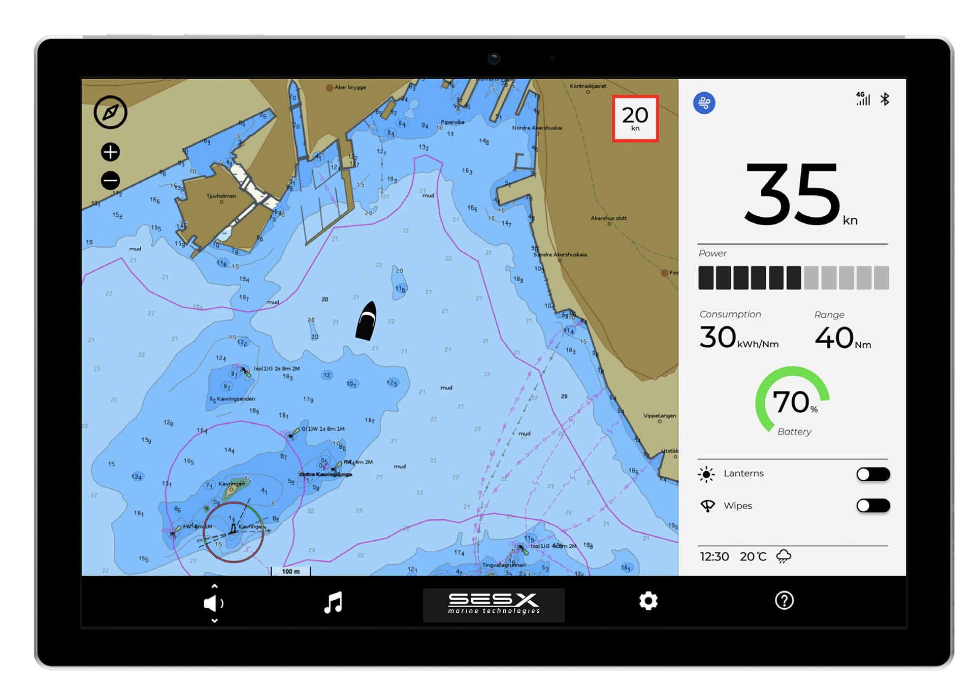
The final prototype featured a main menu bar, with a second one opening when in that setting. We included settings such as bluetooth and music handling, general display and sound controls, manuals for quick help with the boat and their hull technology, and a control for pumping out water in the boat.
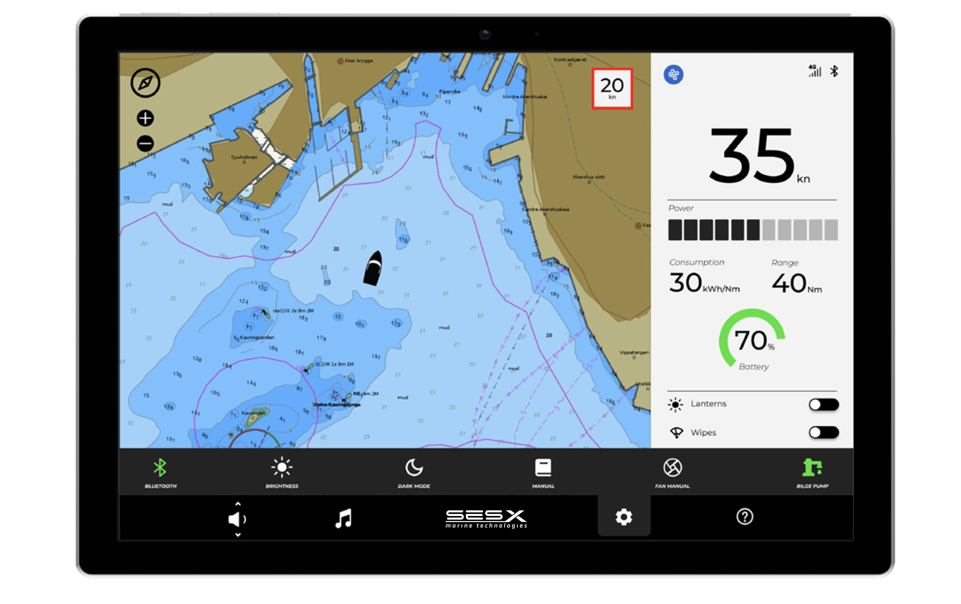
We left some of the settings on the main display at all times due to safety or convenience, such as lights and windshield wipers. Since the vessel is an electric boat, we enlarged the information on speed in knots (with the regulatory speed limit in red square if over the limit), power consumption statistics and battery percentage remaining.
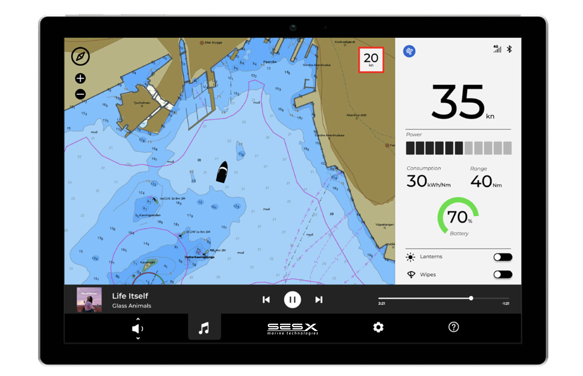
We ended up with a solid MVP, which included all the necessary functions, plus some music control. We also provided the company with a categorised list of functions to include in the future, such as the map visualising how far you can go before you have to turn back to charge, depth indication below the boat to avoid hitting the ground, or a quick call button for assistance.
This project was extremely fun to work with, not only because I got to design a dream screen for a boat, since I grew up with a more traditional boat where the buttons for the lights and horn stopped working years ago, but because I got to work with such a diverse team. It taught me the value of designing for the essentials first, since the developers always answered, when I asked if something would be hard to make, that "it's not that it's too hard, it will just require many months of work, or a bigger team to finish in time". Or when the business department taught me that people like updates and reliability, so to start small with something that works, and to slowly implement new and stable functions is a better strategy than to go overboard in the beginning. I think about this all the time.